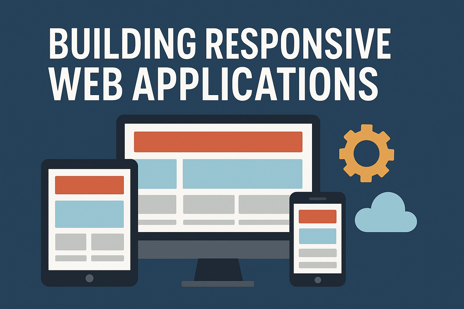
Building Responsive Web Applications
In today's digital landscape, responsive design is not just a nice-to-have feature—it's essential. Learn the best practices for building web applications that work seamlessly across all devices.
Mobile-First Approach
Start designing for mobile devices first, then enhance for larger screens.
/* Mobile styles (default) */
.container {
  padding: 1rem;
  max-width: 100%;
}

/* Tablet and up */
@media (min-width: 768px) {
  .container {
    padding: 2rem;
    max-width: 750px;
    margin: 0 auto;
  }
}

/* Desktop and up */
@media (min-width: 1024px) {
  .container {
    max-width: 1200px;
  }
}
Flexible Grid Systems
Use CSS Grid and Flexbox to create flexible layouts that adapt to different screen sizes.
.responsive-grid {
  display: grid;
  grid-template-columns: repeat(auto-fit, minmax(300px, 1fr));
  gap: 1rem;
}
Responsive Images
Ensure images scale properly across devices.
.responsive-image {
  max-width: 100%;
  height: auto;
  object-fit: cover;
}
Touch-Friendly Design
Make sure interactive elements are large enough for touch devices.
.button {
  min-height: 44px;
  min-width: 44px;
  padding: 0.75rem 1.5rem;
}
Performance Considerations
- Optimize images for different screen densities
- Use appropriate image formats (WebP, AVIF)
- Implement lazy loading
- Minimize HTTP requests
Testing Your Responsive Design
- Use browser developer tools
- Test on actual devices
- Use online testing tools
- Check different orientations
Conclusion
Responsive design is crucial for modern web applications. By following these best practices, you can create applications that provide an excellent user experience across all devices.
